Responsive Flutter App
by Ans Ali Zaidi
Creating responsive applications is crucial to providing a seamless experience across different devices and screen sizes. Flutter, with its "write once, run anywhere" philosophy, offers various tools and techniques to ensure your app looks great on all devices, from tiny phones to large tablets and desktops. There are several methods to make your Flutter app responsive.
Understanding Flutter's Layout System
Flutter uses a flexible and powerful layout system. The core concepts include:
Widgets
Everything in Flutter is a widget, including layout models.
Box Constraints
Widgets are sized according to constraints imposed by their parent widgets.
Flex Widgets
Row, Column, and Flex allow you to create flexible layouts.
Understanding these concepts is fundamental for creating responsive designs.
Use the MediaQuery Widget
The MediaQuery widget provides information about the size and orientation of the screen. You can use it to adjust the layout dynamically:
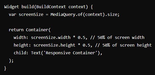
MediaQuery helps adapt sizes, paddings, and other dimensions based on the screen.
Flexible and Expanded Widgets
Use Flexible and Expanded widgets to allocate space within a Row or Column. They adjust automatically based on available space:
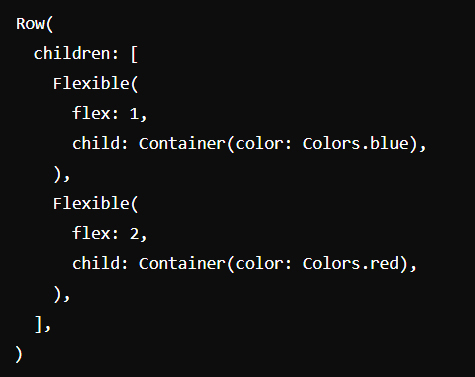
This setup allows the blue container to take up one-third of the space, while the red container takes up two-thirds.
LayoutBuilder Widget
The LayoutBuilder widget allows you to build widgets based on the parent widget’s constraints:
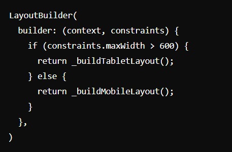
This approach is effective for creating different layouts for phones and tablets.
Use AspectRatio
The AspectRatio widget can maintain a consistent aspect ratio regardless of the screen size:
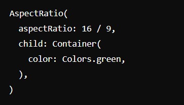
Using aspect ratios is a great way to ensure visual elements remain proportionate.
Use the FittedBox
The FittedBox widget scales and positions its child within the available space:
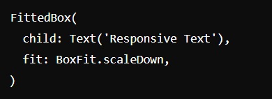
This widget is particularly useful for scaling text or images within a constrained area.
Breakpoints and Custom Layouts
For more complex applications, consider defining breakpoints for different screen sizes:
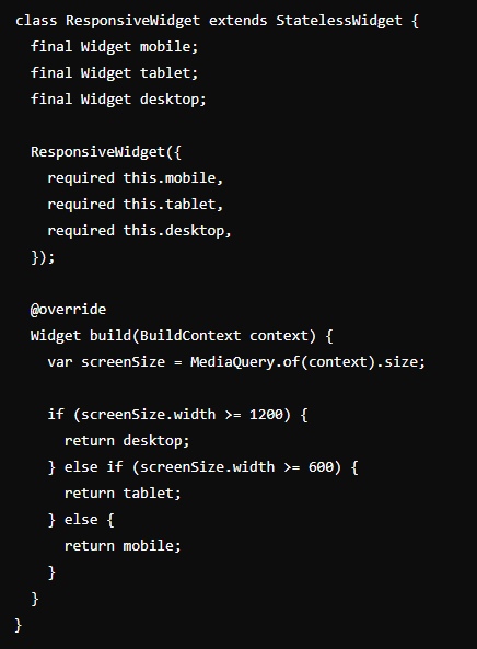
This pattern helps deliver tailored experiences for different devices.
Third-Party Packages
Flutter offers several third-party packages to simplify responsive design:
flutter_screenutil
A popular library for adapting UI to different screen sizes.
responsive_builder
Provides a widget for building responsive layouts.
responsive_framework
Helps you create responsive layouts more easily by providing a set of breakpoints and utilities.
Testing Responsiveness
Always test your app on multiple devices and screen sizes to ensure a consistent experience. Use Flutter's built-in emulators and simulators, as well as real devices, to check how your app behaves.
Conclusion
Making a Flutter app responsive requires understanding the layout system, using widgets effectively, and applying the right techniques. By leveraging Flutter's powerful tools and widgets, you can create a seamless, responsive user experience across all devices.
Stay Updated with Our Blog
Follow our blog for more insights and updates on mobile app development and other technology trends.